To make things simple, this page is for voting for the main image on the characters pages. Everyone gets one vote per character. If you don't sign your post with four (~), your vote does not count. You must also have an account.
I'm going to put a few images of each character here, and everyone vote on what image you want. If you have one that you'd like to be considered, put it in the slideshow under the correct name and lable it with "Image X" (X being the number the image is.)
*If a new image to pick from is added, you are welcome to change your vote. *
Note: If you add a picture make sure it goes to the end of the gallery.
For now, I'm only doing these five characters. If voting works well, then this process will extend to all of them.
Since the voting seems to have died, for now I'm going to add Ohba and Obata's artwork. The voting is still open, so feel free to vote and add pictures. MarleneZ.Talk 04:39, January 14, 2012 (UTC)
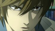
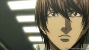
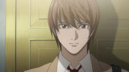
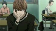
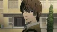
Light Yagami Edit
Edit
Voting Area-Light Edit
Edit
- Add your vote by making a bullet. Like this:
- Vote: Image 2. If you want, you can put a reason for why you like the image, but you do not have to.MarleneZ.Talk
- Vote: Image 'current.' I think it's more expressive of what lurks beneath the surface... Image 2 seems too much like a simple (bland?) mugshot. That may make it a better candidate for profile pic, so I might change my vote based on that, though I'd rather see if a better one can be found, both expressive (maybe more so than the current one), and wider angle (closer to image 2). Of the three, 'current' and 'Image 2' are definitely the better choices. --Tetracapillactomist 10:14, January 10, 2012 (UTC)
- Image 2; too tired to explain why. Maybe when I'm more awake I will. -.- Mikazuki 00:10, January 19, 2012 (UTC)
- I vote for image 2 as well. Because light is looking natual and we can see his body in the picture Kira4real03:54, January 23, 2012 (UTC)
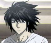
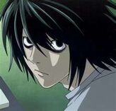
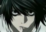
L Lawliet Edit
Edit
Voting Area-L Edit
Edit
- Note: I'm still looking for more images, but you're welcome to vote for the current one or add another one.MarleneZ.Talk
- Vote : image 2
- I vote for the current image. It's a nice close-up of L and we can see his body Kira4real 03:56, January 23, 2012 (UTC)
- Image 2
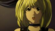
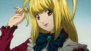
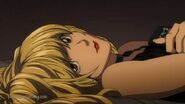
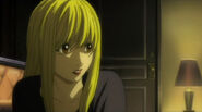
Misa Amane Edit
Edit
Voting Area-Misa Edit
Edit
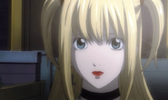
- Vote: Image 4. But I'd like for a different image to be found. MarleneZ.Talk
- Vote: Image 2. Seems to fit her being a dreamer. And very sentimental, prone to swooning. Again, though, image 4 seems more... 'appropriate?' But somehow not truly/completely expressive of her character, so I agree, and again: waiting to see if a better one can be found. (Increasingly glad about change of votes being a possibility!... :)) --Tetracapillactomist 10:29, January 10, 2012 (UTC)
- I vote image 1. Same reason as what I said for Light and L Kira4real 03:58, January 23, 2012 (UTC)
- Image 2
Mello Edit
Edit
Voting Area-Mello Edit
Edit
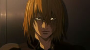
- Vote: Image 2. However, I'm in favor of getting a good one of him without his scar, since that was his original appearance. MarleneZ.Talk
- Vote: Image 2. Seems good, with the proviso above - again, if a better one's found... Although this one's expressive, and it does feature his weakness and sustenance: chocolate. Fitting enough... :) --Tetracapillactomist 10:35, January 10, 2012 (UTC)
- 1 same as before Mikazuki 00:10, January 19, 2012 (UTC)
- Image 1
Near Edit
Edit
Voting Area-Near Edit
Edit
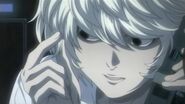
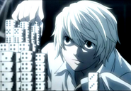
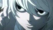
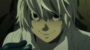
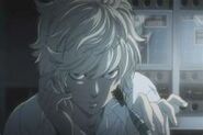
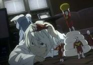
- Vote: Image 1. I think the current image is too close to his face. Now I'm leaning towards Image 2 since it's clear and good quality, and shows his face well. I wish it wan't so close to his face though. The one of him on the floor shows his toy love, but it's not a close up. MarleneZ.Talk
- Vote: Image 1. But not completely convinced about it. Current one is not only cropped too tightly, but is at a sharp angle, compressing his features vertically. Both show a habit/tic of his: twiddling his hair in one, stacking like L in the other. If one can be found with him doing what he does in the current profile pic, but at a wider and more neutral angle, that would be great (and would avoid him being partially obscured, or at least having to compete for visual space with the objects he has stacked). --Tetracapillactomist 10:51, January 10, 2012 (UTC)
- 2 Mikazuki 00:10, January 19, 2012 (UTC)
- Image 2
Images Edit
Edit
How would everyone feel about keeping Obata's artwork as the images, instead of images from the anime?
Personally, I like the idea for a few reasons:
- Light and L are shown with expressions that are 'neutral' and don't suggest a particular good/evil alignment.
- In Misa's case, the image shows her with the correct eye color and is a good representation of her style and personality.
- Overall, the images are clearer than most anime images that can be found.
The only ones I have an issue with currently are the ones of Near and Mello. I think they both look a bit too serious, and Mello has his scar. I think better candadites would be their appearances on the manga covers.
Please leave your thoughts below:
Image Talk Edit
Edit
It isn't necessary to use bullets here, just please sign your post. MarleneZ.Talk 22:57, January 24, 2012 (UTC)
23:16, January 24, 2012 (UTC)



.jpg)
No comments:
Post a Comment